ZOYA PARIS / Brand Identity, Digital Design
Zoya is a production company based in Paris, that diversifing their business and representing a variety of production profiles and international film directors, is in constant seek for new talents. Zoya approached Manuel to rebrand its identity and visualize the evolution happening under a new period. A new brand to communicate the approach of the brand for a unic way to look at things, and it’s strength in the film production industry.
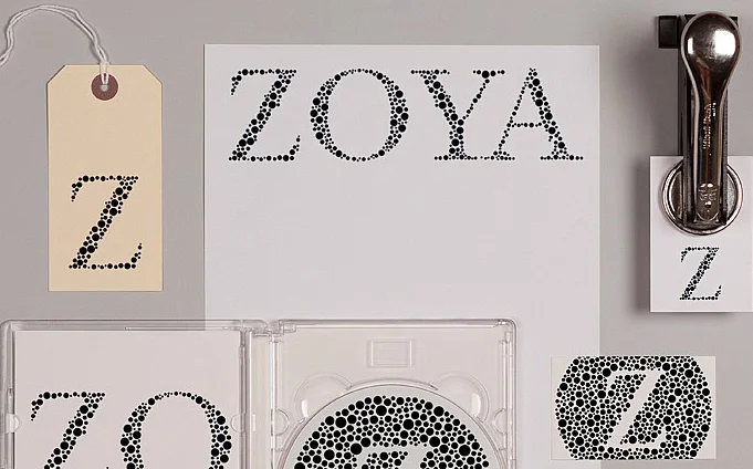
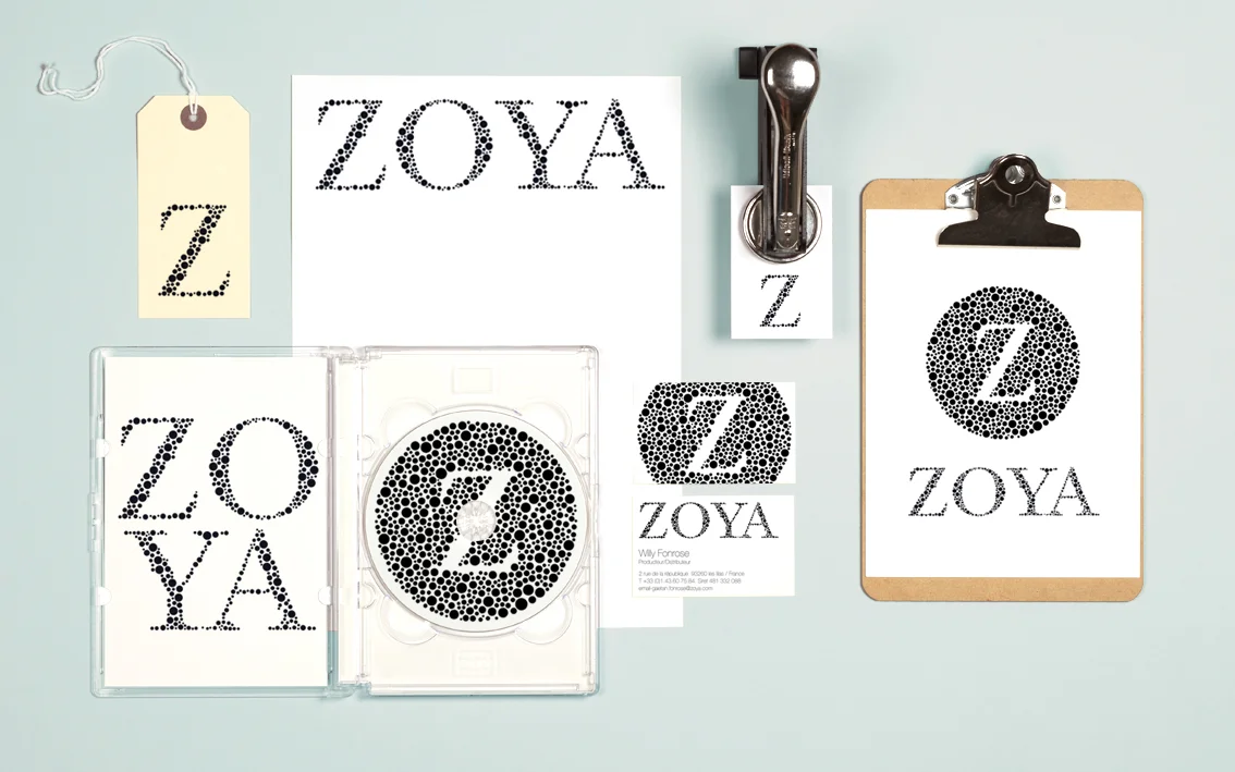
Manuel proposed the development to it’s brand image, using the “Z” of Zoya upgrading it to a more playful but classic use of it, by creating classic mosaic illustration patterns and typeface representations of the name in the form of the Ishihara colour blind test. Each of the representations contains a circle of dots appearing randomized in size.
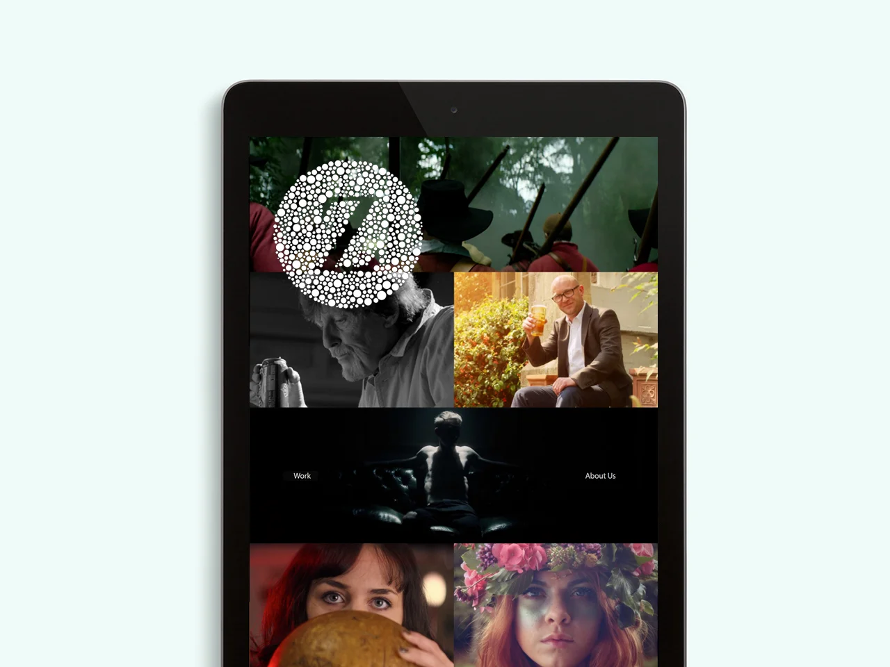
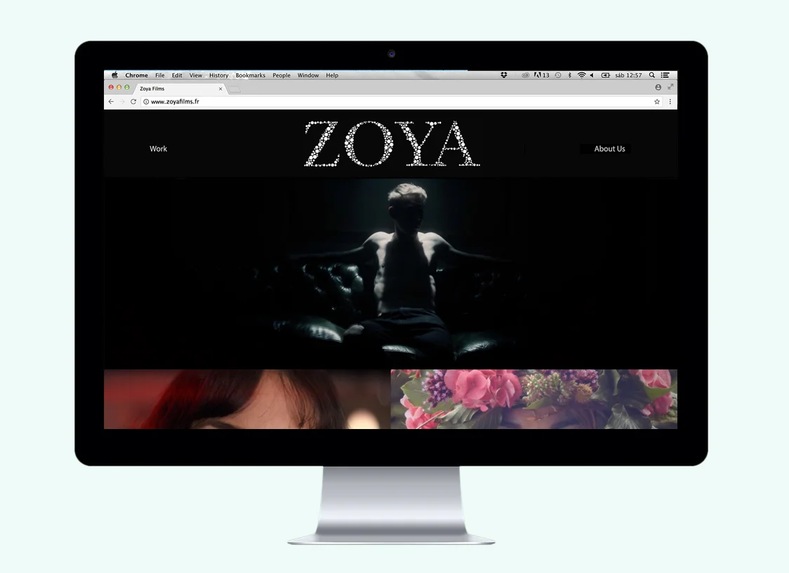
The new design was created considering every online platform, as it’s the company’s main communication channel. Application was extended to the website, social media, as well as stationary and signage. The graphic composition of each element is clean and classic, with negative space that give the symbol strength. Manuel adapted a classic identity into a flexible system that shows the characteristics of each of the company’s departments as a whole.