
APOTEKA SPIRIT / Brand Identity, Digital Design, Campaigns
This project was initiated by a pharmaceutical family business. They couldn’t find a range of cosmetic products that would cover the real healthcare of their most concern costumers.
The initial phase was to create a name that reflected a product line of truly healthy cosmetic products.

We then generated a visual system that differentiates it from any other pharmaceutical product and that unify all the products in their line by representing the kind of care their customers were used to.
Apoteka Spirits’ mission is to create the first custom cosmetic house in Spain. However the usage is either restricted to natural elements or locally produced components, Apoteka Spirit hopes to create a niche for products with global appeal for those costumers who care about the impact of cosmetic usage in their health.
A strategic analysis of the client revealed the importance of showing a caring attitude of a new brand to the market, whilst also establishing the credibility that a traditional family business making brought to the product in the pharmaceutical industry.
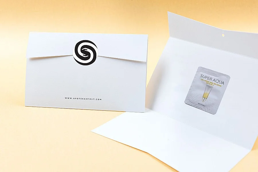
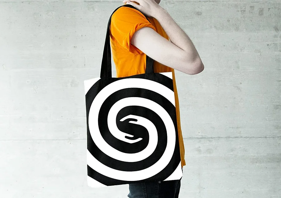
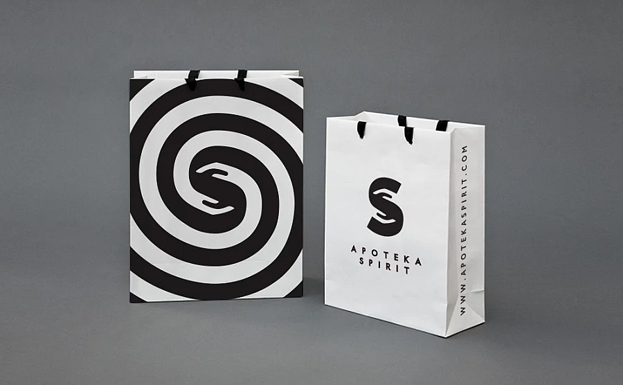
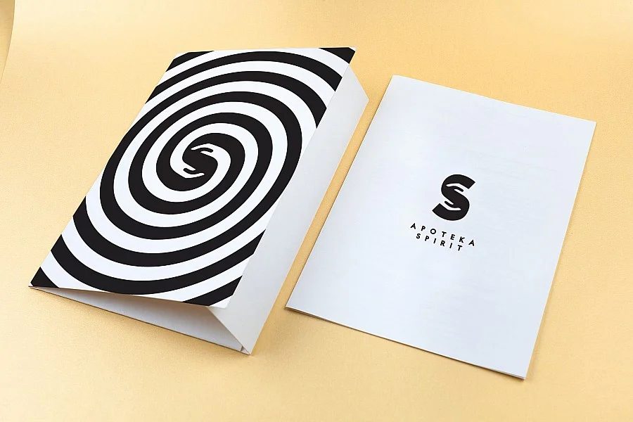
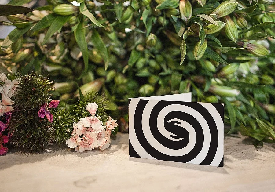
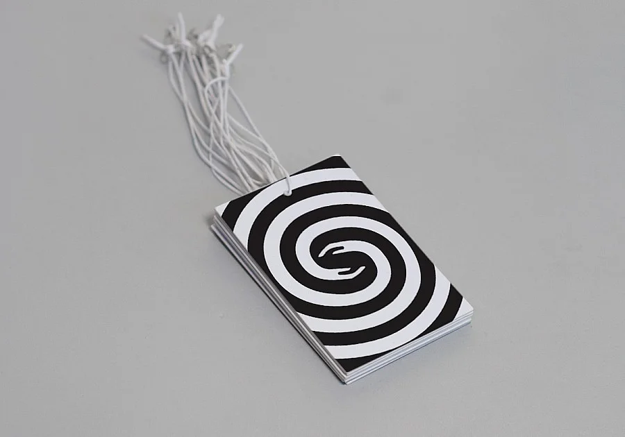
Accordingly, we created a simple, rational and easy to recognize symbol. By connecting the spiral element to two hands as a caring element, the construction of the ‘S” of the name was turned into the brand symbol. The application of it into the different elements used in the communication positioned the brand as a contemporary, style conscious player.
Based on the customize product service, the packaging for the solutions was produced.
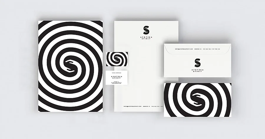
Along with the corporate identity, I helped Apoteka Spirit to develope a brand architecture scheme for the product line brands, helping to establish a communication structure and thus correctly convey each products’s nature and identity to their established consumer target.